

Rebrand & Website Development for Marietta, GA Law Firm, Reed Leeper, P.C.
Overview
This collaborative project aimed to rebrand Reed Leeper, P.C., a Marietta, GA-based law firm, with a comprehensive overhaul of their website and logo. Stemming from the crucial need to reflect the firm’s successful litigation history during a significant rebrand, the outdated logo was refreshed to align with the new dynamics of the firm. Simultaneously, a new website was crafted to seamlessly deliver updated information, streamline the online presence, and enhance accessibility.
As you explore the journey detailed below, you’ll uncover the story of triumphs and challenges that shaped our path toward achieving these goals.
The Problem
Rebranding Needs & Website Overhaul
After a partnership shift at their firm, Chad Reed and Jeff Leeper assumed roles as the new and only partners of Reed Leeper, P.C. Due to this change, their law firm required an overhaul of its brand elements. The existing logo, website, and overall branding had become outdated and no longer reflected the firm’s identity, necessitating a comprehensive redesign to address this misalignment.
The challenges extended beyond branding their current website, which presented a series of issues:
The outdated site still featured the old logo until its update around late September and retained old staff names, creating inconsistencies.
Designed with numerous varying graphic elements, the website’s navigation proved confusing, overwhelming users with dense blocks of text without providing clear accessibility tools or language translation options.
These shortcomings highlighted the critical need for a revamped online presence to enhance user experience and align with the firm’s new branding.
The Solution
Stage 1 - Alpha
The Alpha phase kicked off by finalizing the new logo and incorporating it into our comprehensive style guide. This guide encompassed the firm’s updated color palette, typography, relevant abbreviations, mission and tagline, and imagery. Serving as the foundation, this comprehensive guide played a crucial role in maintaining a cohesive and well-aligned design structure for our website.
Leveraging our style guide, we developed a website prototype using Figma, showcasing our redesign and emphasizing three key features: accessibility, language translation, and simplicity. Ensuring consistency, we applied the same design framework to a Spanish-translated section in the Figma file, and notably prototyped every page’s complete translation to showcase the user experience with the translate button.
Combining the guidelines from our style guide with the concepts of the prototype, we initiated the development process for the WordPress website using GoDaddy as the hosting server. To conclude the Alpha Phase, we crafted a basic wireframe layout, seamlessly integrating design principles with the practical implementation of the website structure.
Stage 2 - Beta
Here is where things accelerated rapidly. Following the layout and wireframe creation in the Alpha phase, we progressed to inputting new information on the website and transferring (but also simplifying and improving) essential existing content. The task of copying over 132 blog posts presented a significant challenge, but our website was finally taking shape!
However, the increased pace during the Beta phase brought about the need for swift adjustments and adaptations. While organizing the blog posts, we faced several obstacles with the WordPress theme. After switching themes three times within the Beta phase, we finally found a theme that fit the needs of our design ideas and was cooperative with our chosen plugins. Having to switch themes several times, we had to update the website’s appearance and content (for the third-or-so time) to align with our established style guide and meet the client’s requirements.
After overcoming numerous challenges, including switching themes multiple times, the redesigned Reed Leeper, P.C. website took shape. Explore the transformation in the video walkthrough!
Key Website Features
Accessibility
In our pursuit of an inclusive website, we integrated a widget located in the top right corner. Our dedication to inclusivity shines through our website’s accessibility tools, providing customizable options to accommodate diverse needs. These include:
Customizable Options: Our website features an accessibility button designed to cater to various needs.
Text Size Control: Effortlessly adjust text size for better readability.
Visual Adjustments: Options for grayscale, high contrast, and negative contrast to suit individual preferences.
Enhanced Readability: Features such as underlined links for clear navigation, a light background for improved visibility, and user-friendly fonts contribute to enhanced readability.
Product Implementation
Despite initial concerns about meeting law firm standards, bridging client expectations, and ensuring accessibility, our collaboration culminated in success. The new website not only met the client’s needs but also became a point of pride for Team GMO. The redesigned logo adorned merchandise and building signage, serving as a tangible representation of our dedication and hard work. The journey highlighted the significance of persistence, adaptability, and practical application in crafting innovative design solutions in a real world application.
Throughout the website creation process, our commitment stayed unwavering in ensuring that our three key features — accessibility, language, and simplicity — were not just met but exceeded. From client meetings to adhering to our style guide, we successfully crafted a website that is both user-friendly and provides a variety of accessibility options. A comparison between the old and new websites clearly illustrates our success in making the site adaptable for those who need it.
Lessons Learned & The Future
Our journey taught us the value of practical application, translating classroom theories into real-world design strategies. The process underscored the significance of adapting to challenges, pivoting when needed, and persisting in the pursuit of design excellence. Looking ahead, possibilities abound for further enhancements, including refining blog displays and exploring additional functionalities for an even more enriched user experience.

Reed Leeper’s New Website
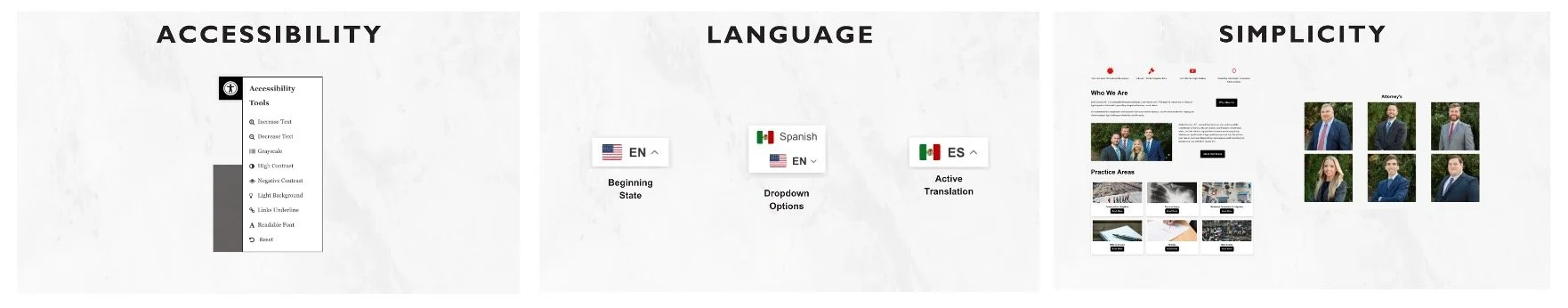
Language Translation
Enabling our users, we’ve included a Translate button for effortless conversion of our website content from English to Spanish. This ensures that our diverse clientele, especially those whose primary language is Spanish, can readily access and understand the information they seek.
Simplicity
Enhancing user experience, our revamped website emphasizes clarity. We’ve streamlined information, ensuring effortless navigation without intricate legal terminology. Understanding legal jargon is challenging; accessing legal representation online shouldn’t be. After reviewing the old website, our focus was on creating a new version that’s easily readable, featuring a clear hierarchy and straightforward navigation buttons.

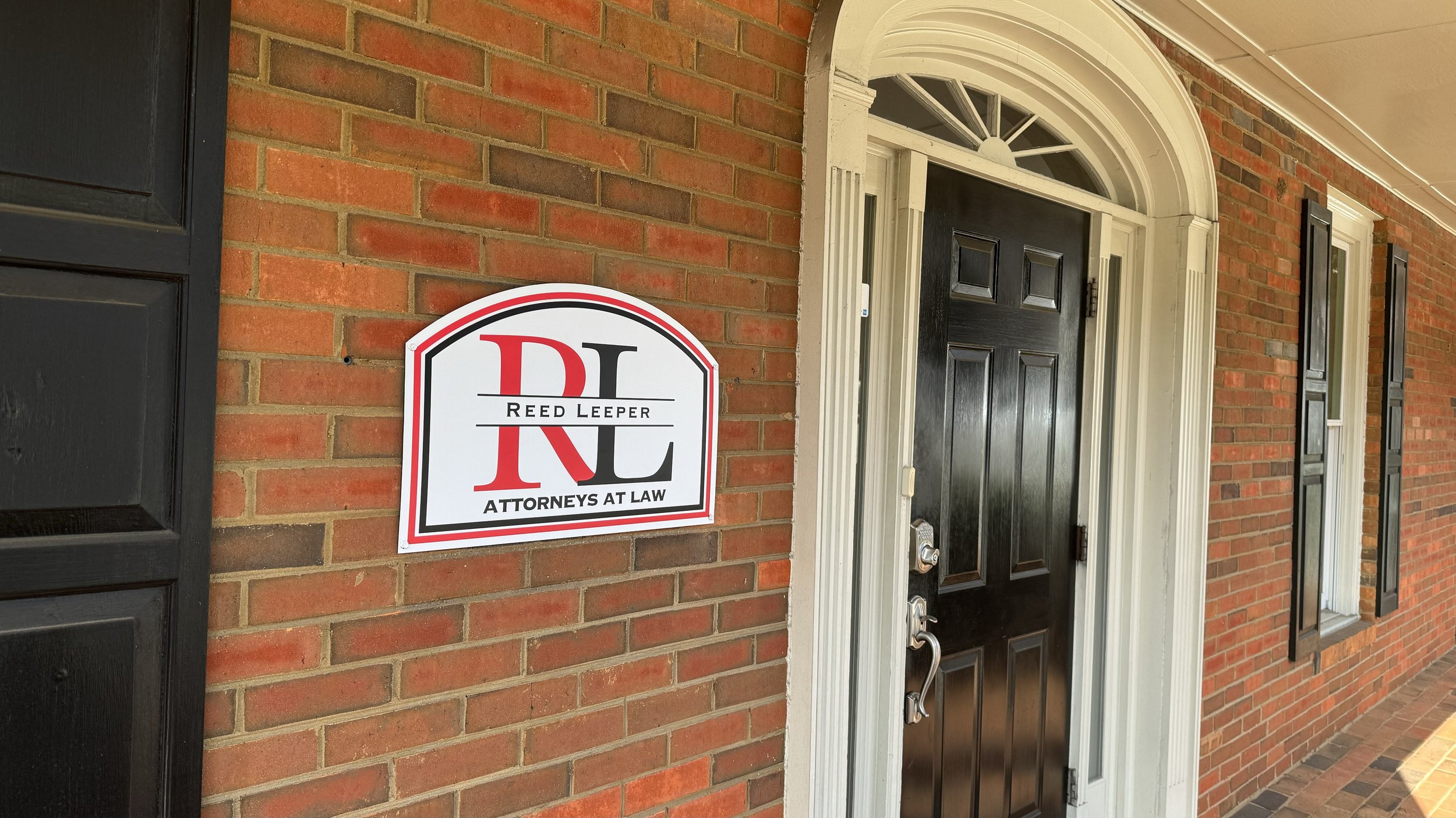

Monument Sign, Building Sign, Charity Golf Tournament Merchandise
Conclusion
The collaborative effort between Team G-M-O and Reed Leeper, P.C. culminated in a comprehensive rebranding and website redesign, balancing the reflection of the firm’s legacy with contemporary needs. Our journey underscored the significance of persistence, adaptability, and practical application in crafting innovative design solutions.
Next in our journey is a semester-long user testing phase, where we aim to gain valuable insights into our fully functioning website and identify any necessary tweaks before bidding farewell to our clients, Chad and Jeff.